


Color Psychology 101: What Every Homeowner Should Know
The colors you choose for your home do more than just decorate—they shape how you feel, think, and interact. Studies show that color psychology can evoke powerful emotional responses. For example:
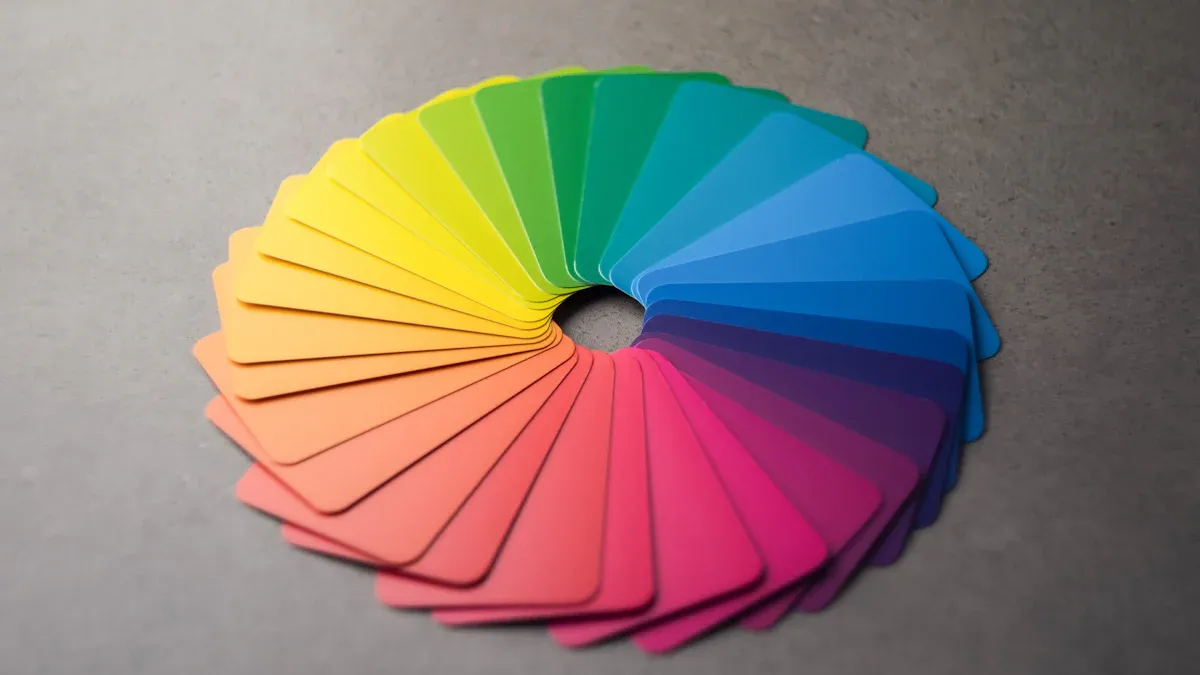
Red creates excitement and energy, while blue promotes calmness.
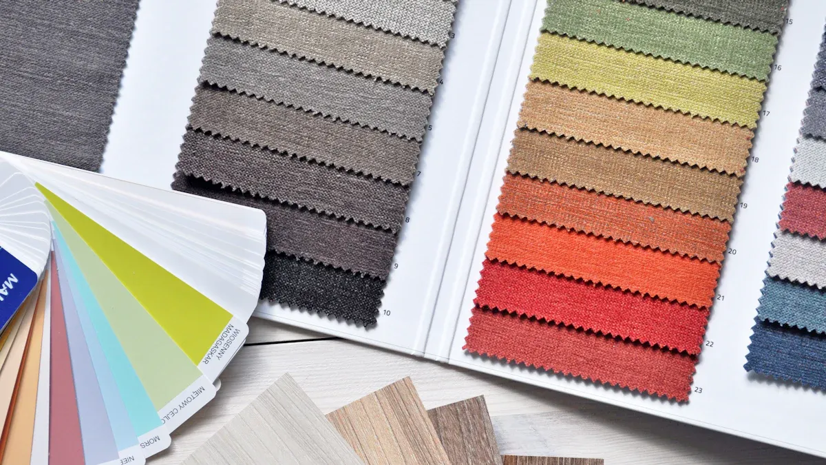
A balanced mix of warm, cool, and neutral tones can make your space feel inviting.
Overwhelming one color can lead to discomfort or unease.
Thoughtful color choices impact your mood, productivity, and even social engagement. Whether it’s painting walls or adding custom curtains, mastering color psychology 101 helps you create a harmonious living space tailored to your personality.
Key Takeaways
Colors affect how we feel and act. Pick warm colors like red and yellow for energy. Use cool colors like blue and green to feel calm.
Follow the 60-30-10 rule for balanced colors. Use 60% for the main color, 30% for a second color, and 10% for accents.
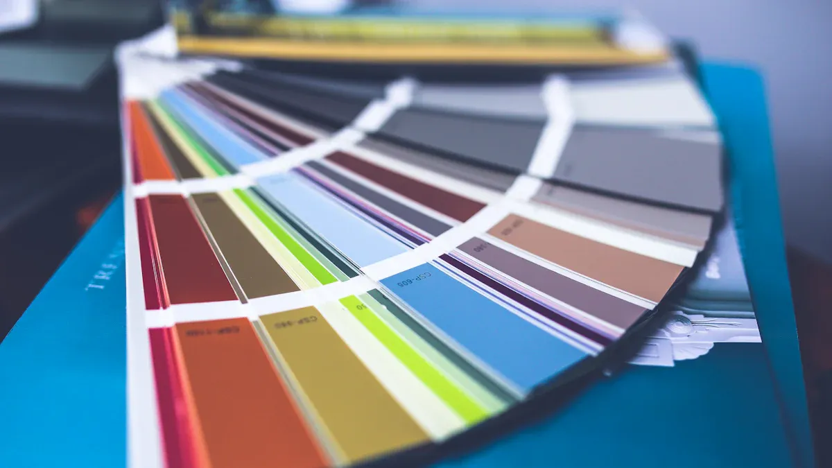
Try paint colors in different lighting. Check how they look during the day to pick the best one.
Add neutral colors for a flexible background. They let you use bright accents without making the room too busy.
Think about what each room is for when picking colors. Match colors to the room’s purpose to boost mood and focus.
Understanding Color Psychology
How Colors Influence Emotions and Behaviors
Colors have a profound impact on how you feel and behave in your home. They can energize, calm, or even inspire creativity. Research shows that specific colors evoke distinct emotional responses. For instance:
Red increases heart rates and excitement, making it a stimulating choice for active spaces.
Blue promotes calmness and relaxation, and it is ideal for bedrooms or reading nooks.
Yellow and orange enhance joy and creativity, perfect for kitchens or playrooms.
Green fosters tranquility, helping you unwind after a long day.
Your color choices can shape the atmosphere of each room. For example, using red in a dining area can encourage lively conversations, while soft blues in a bathroom create a spa-like retreat. By understanding these emotional triggers, you can design spaces that align with your lifestyle and needs.
Warm Colors and Their Impact (e.g., red, orange, yellow)
Warm colors like red, orange, and yellow bring energy and vibrancy to your home. These hues often evoke feelings of warmth, happiness, and enthusiasm. Red, for example, stimulates energy and passion. It works well in dining rooms or social spaces where you want to encourage interaction. However, too much red can feel overwhelming, so balance it with neutral tones.
Orange, a playful and inviting color, sparks creativity and excitement. It’s a great choice for home offices or workout spaces. Yellow, often associated with sunshine, creates a cheerful and welcoming atmosphere. It brightens kitchens, breakfast nooks, or entryways. Studies have shown that yellow-accented workspaces lead to more innovative ideas, making it a smart choice for creative areas.
When using warm colors, consider their intensity. Softer shades like peach or pale yellow can provide warmth without overpowering a room. These colors can make larger spaces feel cozier and more inviting.
Cool Colors for Calm and Relaxation (e.g., blue, green, purple)
Cool colors like blue, green, and purple create a sense of calm and relaxation. Blue, often linked to serenity, lowers stress levels and promotes focus. It’s a popular choice for bedrooms, bathrooms, or study areas. Green, inspired by nature, brings balance and harmony. It works well in living rooms or home offices where you want to feel grounded.
Purple, a mix of blue and red, adds a touch of luxury and creativity. Lighter shades like lavender soothe the mind, while deeper tones like plum create a dramatic and sophisticated look. These colors can transform your home into a peaceful sanctuary.
To maximize the effect of cool colors, pair them with natural materials like wood or linen. This combination enhances the calming vibe and adds texture to your design. Whether you’re picking paint or adding accents, cool tones can help you create the perfect retreat.
The Role of Neutral Colors in Home Design (e.g., white, gray, beige)
Neutral colors like white, gray, and beige play a vital role in creating a balanced and timeless home design. These shades act as a versatile backdrop, allowing you to experiment with bolder accents or vibrant decor without overwhelming the space. For example, a beige wall can highlight colorful artwork or furniture, while a gray sofa pairs effortlessly with patterned cushions.
Neutrals also influence how you perceive space. Light tones, such as white or cream, make rooms feel larger and brighter. This effect is especially useful in smaller spaces or areas with limited natural light. On the other hand, darker neutrals like charcoal gray create a cozy and intimate atmosphere, perfect for bedrooms or reading corners.
Beyond aesthetics, neutral colors contribute to a calming and stabilizing environment. Their unobtrusive nature makes them ideal for spaces where relaxation is key, such as living rooms or bedrooms. Studies show that earthy tones, including beige and soft grays, are increasingly popular for their soothing effects. By incorporating neutrals into your design, you can achieve a harmonious and inviting home.
Tip: Pair neutral walls with natural materials like wood or linen to add texture and warmth to your space. This combination enhances the overall aesthetic while maintaining a serene vibe.
Choosing Colors for Specific Rooms Based on Function and Mood
Each room in your home serves a unique purpose, and the colors you choose should reflect that function. For instance, cool tones like blue or green work well in bedrooms or bathrooms, where relaxation is a priority. These colors create a tranquil atmosphere, helping you unwind after a long day.
In contrast, warm hues like yellow or orange energize and uplift. A kitchen with yellow accents feels cheerful and inviting, while an orange home office sparks creativity and focus. Reception areas or entryways benefit from warm palettes, as they promote a welcoming first impression.
When designing social spaces like living or dining rooms, consider how color influences interaction. Red, for example, encourages lively conversations and adds a sense of excitement. However, balance is key—too much red can feel overwhelming. Pair it with neutrals to maintain harmony.
Note: White can make rooms appear larger and more open, but overusing it may create a sterile or uninviting feel. Add warmth with colorful decor or textured fabrics like Freshine’s Elara Linen Curtains.
Here’s how specific colors align with room functions:
Conference Rooms: Cool tones convey professionalism and focus.
Creative Workspaces: Yellow accents enhance creativity and collaboration.
Bedrooms: Darker shades like navy or plum create a calming retreat.
Living Rooms: Neutral tones provide a versatile base for layering bold accents.
By aligning your color choices with the purpose of each room, you can create spaces that not only look beautiful but also support your daily activities and mood.
Factors to Consider When Choosing Colors
The Effect of Lighting on Color Perception
Lighting plays a crucial role in how you perceive colors in your home. The same paint color can look entirely different depending on the type and intensity of light in a room. For example, natural sunlight enhances warm tones during the day, while artificial lighting can alter the hue in the evening. Experiments have shown that variations in lighting levels significantly affect how accurately people identify colors. In a controlled study, participants struggled to match colors when one side of the room had dim lighting and the other had brighter light. This demonstrates how lighting can influence your perception of color.
When choosing paint colors, test them under different lighting conditions. Observe how they appear in the morning, afternoon, and evening. Pay attention to the type of bulbs you use as well. LED lights often produce cooler tones, while incandescent bulbs create a warmer glow. By considering these factors, you can ensure your color choices remain consistent and appealing throughout the day.
Tip: Use Freshine’s Elara Linen Curtains to control the amount of natural light entering your space. Their breathable fabric allows you to adjust the brightness while maintaining a soft, elegant look.
Room Size and How Colors Influence Space
The size of a room can influence how colors affect its overall feel. Light colors, such as off-white or pale neutrals, make small spaces appear larger and more open. They reflect light, creating an airy and spacious atmosphere. On the other hand, darker shades like navy or charcoal gray add depth and intimacy, making large rooms feel cozier.
For example, if you have a compact living room, painting the walls in a soft beige or greige can visually expand the space. According to industry surveys, 28% of experts recommend greige for its ability to add value and versatility to homes. In contrast, earthy greens, favored by 25% of professionals, work well in bedrooms to create a calming and grounded environment.
To maximize the effects of color in your home, consider the ceiling height and furniture placement. A low ceiling painted in a light shade can make the room feel taller, while darker tones on the walls can bring a sense of balance to expansive spaces. Experiment with accent walls or colorful décor to add personality without overwhelming the room.
Coordinating Colors with Existing Décor and Custom Curtains
Creating a cohesive design involves coordinating your color palette with existing décor and custom elements like curtains. Start by identifying the dominant colors in your furniture, rugs, or artwork. Use these as a foundation to build a harmonious scheme. For example, if your sofa features earthy tones, choose complementary shades like beige or olive green for the walls.
Custom curtains, such as Freshine’s Elara Linen Curtains, can tie the entire look together. Their timeless design and natural texture blend seamlessly with various interior styles. To achieve a polished finish, consider these tips:
Add trims or embellishments to personalize ready-made curtains.
Dye or paint curtains to match your desired aesthetic.
Combine different curtain panels for a unique, layered effect.
A case study by Blinds Couture highlights the transformative power of custom drapery. Before-and-after scenarios show how well-coordinated curtains enhance the overall ambiance of a room. For instance, pairing neutral walls with linen curtains creates a serene and inviting space. The Elara Linen Curtains, with their soft texture and light-filtering properties, are an excellent choice for achieving this balance.
Section |
Description |
|---|---|
Styling Tips and Tricks |
Advice on ensuring drapery complements and enhances interior décor. |
Pairing Draperies with Interiors |
Insights from experts on creating a cohesive look with drapery and décor. |
Transformations by Blinds Couture |
Examples of how custom drapery can elevate a room’s design. |
By aligning your color choices with your décor and incorporating versatile elements like curtains, you can create a space that feels both stylish and cohesive.
Matching Colors to the Purpose of Each Room
Every room in your home serves a unique purpose, and the colors you choose should reflect that function. Thoughtful color choices can enhance the mood and functionality of each space, creating an environment that supports your daily activities.
Living Rooms and Common Areas
Living rooms and common areas are often the heart of the home, where family and friends gather. Bold and energetic colors like red or orange can encourage conversation and create a lively atmosphere. If you prefer a more relaxed vibe, consider neutral tones like beige or gray as a base, then add pops of color through décor or accents. These spaces benefit from a balance of warmth and energy to make everyone feel welcome.
Bedrooms
Bedrooms are your personal retreat, a place to unwind and recharge. Cool colors like blue, green, or lavender promote relaxation and calmness, making them ideal for this space. Darker shades, such as navy or plum, can create a cozy and intimate feel, perfect for restful nights. Pair these colors with soft textures, like Freshine’s Elara Linen Curtains, to enhance the tranquil atmosphere.
Kitchens and Dining Areas
Kitchens and dining areas thrive on energy and warmth. Yellow and orange are excellent choices for these spaces, as they evoke feelings of happiness and stimulate appetite. A kitchen with yellow accents feels cheerful and inviting, while orange can spark creativity in your cooking. If you prefer a more modern look, white or light gray walls paired with colorful furniture can create a clean yet vibrant space.
Home Offices and Study Areas
Home offices and study areas require focus and productivity. Cool tones like green or blue help reduce stress and improve concentration. Green, inspired by nature, fosters balance and harmony, while blue promotes mental clarity. Adding a touch of yellow can spark creativity, making it a great accent color for workspaces. Keep the design simple and uncluttered to maintain a productive environment.
Bathrooms
Bathrooms are spaces for relaxation and rejuvenation. Soft blues, greens, or neutral tones like white and beige create a spa-like atmosphere. These colors make the space feel clean and serene. To add a touch of luxury, consider incorporating accents in deeper shades like teal or charcoal gray. Pair these colors with natural materials, such as wood or linen, to enhance the calming effect.
Evidence in Action
The connection between color and room function is well-documented. For example:
Room Type |
Color Choices |
Emotional Impact |
|---|---|---|
Classrooms |
Calming colors (green, blue) |
Elicit calmness, relaxation, happiness |
Bright colors (red, orange) |
Attract attention, energize, stimulate engagement |
|
Libraries |
Calming colors (green, blue) |
Promote reflection and relaxation |
Bright colors for furniture |
Create excitement in lounging areas |
|
Common Areas |
Bold, energetic colors |
Encourage conversation and play |
School colors |
Foster school spirit and welcome visitors |
|
Lunch Rooms |
Bright or muted wall colors |
Energetic and welcoming atmosphere |
Colorful furniture |
Adds life and vibrancy to the space |
This table highlights how specific color choices align with the purpose of various spaces. Applying these principles to your home can help you create rooms that not only look beautiful but also serve their intended function effectively.
Tip: Start small when experimenting with colors. Add accents like curtains, rugs, or throw pillows to test how a color feels in a room before committing to larger changes like painting walls.
Creating a Cohesive Color Palette
Applying the 60-30-10 Rule for Balanced Design
The 60-30-10 rule is a simple yet effective guideline to create a cohesive color palette in your home. This method divides your room’s colors into three proportions: 60% for the primary color, 30% for the secondary color, and 10% for the accent color. The primary color typically covers large areas like walls or floors, while the secondary color adds contrast through furniture or rugs. The accent color brings personality with smaller elements like throw pillows or artwork.
This approach prevents colors from competing for attention, ensuring harmony and balance. For example, a living room with neutral walls (60%), a navy sofa (30%), and gold accents (10%) feels both stylish and cohesive. Many professional designers rely on this rule to achieve visually appealing interiors. Studies show that this ratio helps maintain order and avoids overwhelming the senses.
Tip: Use Freshine’s Elara Linen Curtains as part of your 60% or 30% color proportion. Their neutral tones and natural texture blend seamlessly into any palette.
Transitioning Colors Between Rooms for Flow
Transitioning colors between rooms ensures a natural flow throughout your home. To achieve this, use a consistent base color across all spaces, then introduce complementary shades in each room. For instance, if your living room features beige walls, carry that color into the hallway and add a soft green in the adjacent bedroom. This creates a seamless transition while maintaining individuality in each space.
Design experts recommend keeping door casings neutral when transitioning to a room with bold colors. This technique avoids abrupt changes and enhances the overall flow. Matching the inside strip of a door to the room it swings into also adds consistency.
Note: A cohesive color palette doesn’t mean every room must look identical. Instead, aim for subtle connections that tie your home together.
Combining Bold and Neutral Tones for Harmony
Combining bold hues with neutral tones creates a harmonious and dynamic interior. Neutrals like white, beige, or gray serve as a calming backdrop, allowing bold colors to shine without overwhelming the space. For example, a monochromatic palette with varying shades of blue can feel serene, while a bold orange accent wall adds energy and focus.
The 60-30-10 rule works well here. Use neutral tones for 60% of the room, bold colors for 30%, and vibrant accents for the remaining 10%. A dining room with gray walls, a teal rug, and yellow decor demonstrates how this balance enhances visual interest. Statement furniture, like a bright red armchair, can also add personality without disrupting harmony.
Example |
Description |
|---|---|
Accent Walls |
A bold color on one wall creates a focal point while keeping balance. |
Statement Furniture |
Vibrant pieces like sofas or chairs add character without overwhelming. |
By thoughtfully combining bold and neutral tones, you can create a cohesive color palette that feels both balanced and inviting.
Using Color to Highlight Architectural Features
Architectural features like crown moldings, trim, and built-in shelves add character to your home. Using color strategically can make these elements stand out, enhancing the overall design. By choosing the right shades, you can draw attention to unique details while creating a cohesive look.
Start by identifying the architectural features you want to highlight. For example, painting crown moldings in a contrasting color can frame a room beautifully. Light-colored trim against darker walls creates a striking effect, while darker trim on light walls adds depth and sophistication. Similarly, accentuating built-in shelves with a bold hue can turn them into focal points.
Different architectural styles call for specific color palettes. The table below provides examples of how to use color effectively based on your home’s design:
Architectural Style |
Suggested Colors |
Description |
|---|---|---|
Classic & Traditional |
Whites, blues, deep reds |
Enhances curb appeal and aligns with traditional aesthetics. |
Modern & Minimalist |
Sleek grays, blacks, natural wood tones |
Creates bold statements and complements modern designs. |
Warm & Inviting |
Earthy beiges, browns, greens |
Complements Craftsman and Farmhouse styles, creating a welcoming atmosphere. |
High-Contrast Drama |
Dark siding with light trim |
Adds depth and sophistication to the overall look. |
Victorian Architecture |
Deep colors like dark blue, greens, reds, yellows |
Reflects the rich color palettes typical of the Victorian era. |
Colonial Style Homes |
Earthy tones, gray paint with white trim |
Matches well with brown roofs and red bricks, creating a timeless look. |
Mediterranean Style Homes |
Darker tones for trim, lighter shades for exterior |
Creates a contemporary look while maintaining the essence of Mediterranean architecture. |
Tip: Use neutral tones for walls and bold colors for trim to highlight intricate details without overwhelming the space.
You can also use color to emphasize architectural symmetry. For instance, painting window frames in a contrasting shade can make them pop, while using the same color for doors and shutters ties the exterior together. Indoors, consider painting a fireplace mantel in a complementary color to make it the centerpiece of the room.
By thoughtfully applying color, you can celebrate your home’s unique features and elevate its overall aesthetic.
Common Mistakes to Avoid
Overusing Bold or Intense Colors
Bold colors can add personality and energy to your home, but using them excessively may lead to overstimulation. Bright shades like orange or pink, while uplifting in small doses, can overwhelm a space when overused. This overstimulation can negatively impact mental health, making rooms feel chaotic rather than inviting. For example, a living room painted entirely in a vibrant orange might feel exciting at first but could become overwhelming over time.
To avoid this, balance bold colors with neutral tones. Use bold shades as accents—on a single wall, through artwork, or in decorative pieces like cushions. This approach allows you to enjoy the vibrancy without overpowering the room. Remember, a mix of colors enhances a room’s appeal, while relying solely on bold tones can create visual discomfort.
Tip: If you love bold colors, start small. Add them through accessories or furniture before committing to larger surfaces like walls.
Ignoring the Role of Lighting in Color Selection
Lighting significantly influences how colors appear in your home. The same shade can look entirely different depending on the direction and type of light. For instance, a room with natural light from the north may make colors appear cooler, while southern light enhances warm tones. Research shows that variations in illumination can alter how you perceive hues, even changing the emotional associations linked to them.
When choosing colors, test them under different lighting conditions. Observe how they look in the morning, afternoon, and evening. Artificial lighting also plays a role. LED bulbs often create cooler tones, while incandescent bulbs add warmth. Ignoring these factors can lead to unexpected results, leaving you dissatisfied with your choices.
Lighting Factor |
Impact on Color Perception |
|---|---|
Lighting Direction |
Colors appear differently depending on the room’s orientation (north, south, east, west). |
Color Evaluation |
Subtle hues like pink or green may shift under varying light intensities. |
Emotional Associations |
Changes in lighting can alter the mood and connotations of a color. |
Note: Use curtains like Freshine’s Elara Linen Curtains to control natural light and enhance the effects of your chosen colors.
Skipping Paint Sample Testing
Skipping paint sample testing is a common mistake that can lead to regret. Colors often look different on a swatch than they do on your walls. Factors like lighting, room size, and surrounding décor can all influence how a color appears. Without testing, you risk choosing a shade that clashes with your space or feels too intense.
Always test paint samples on your walls before committing. Apply small patches in different areas of the room and observe them at various times of the day. This process helps you see how the color interacts with light and other elements in the space. It also allows you to identify any unexpected undertones that may emerge.
Tip: Test multiple shades of the same color family to find the perfect match for your room.
Choosing Trendy Colors Without Considering Longevity
Trendy colors often grab your attention with their boldness and uniqueness. They dominate design magazines and social media feeds, making them hard to resist. However, choosing a trendy color without considering its longevity can lead to regret. What feels fresh and exciting today might feel outdated in just a few years.
Trends change quickly. A color that looks modern now could clash with your home’s style later. For example, bright neon shades gained popularity in recent years but faded just as fast. If you paint an entire room in a trendy shade, you may find yourself repainting sooner than expected. This not only costs time but also adds unnecessary expenses.
Instead of fully committing to a trend, consider using it in smaller, replaceable elements. Throw pillows, rugs, or artwork allow you to experiment with trendy colors without permanent changes. These items are easier to swap out when trends shift. For walls or large furniture, stick to timeless shades like neutrals or soft pastels. These colors provide a versatile base that adapts to changing styles.
When selecting a color, think about how it fits into your long-term vision for your home. Ask yourself if you’ll still love it five years from now. Trends can inspire creativity, but timeless design ensures satisfaction for years to come.
Tip: If you want to incorporate trendy colors, start small. Add accents like curtains or decorative pieces to test how they feel in your space.
Enhancing Your Home with Custom Curtains
How Curtains Complement Your Color Palette
Curtains play a vital role in tying your room’s color palette together. They can either blend seamlessly with your existing design or act as a bold accent to elevate the overall look. By carefully selecting patterns, textures, and colors, you can create a cohesive and visually appealing space.
Layering window treatments adds depth and flexibility to your design. For example, pairing sheer curtains with heavier drapes allows you to control light while enhancing the room’s aesthetic.
Patterns can either complement or contrast with other elements in the room. A patterned curtain that mirrors the colors of your furniture or rugs creates harmony.
Solid-colored curtains that match or complement patterned drapes unify the design and prevent visual clutter.
When choosing curtains, consider how they interact with your walls, furniture, and accents. A neutral curtain can balance a vibrant room, while a bold curtain can add personality to a neutral space. This thoughtful coordination ensures your custom curtains enhance your décor effortlessly.
The Versatility of Elara Linen Curtains in Home Design
Freshine’s Elara Linen Curtains offer unmatched versatility for any room in your home. Their timeless design and natural texture make them suitable for both modern and traditional interiors. Whether you want to create a cozy bedroom or a sophisticated living room, these curtains adapt to your style.
The breathable linen fabric provides a soft, elegant look while allowing natural light to filter through. This feature makes them ideal for spaces where you want to maintain brightness without sacrificing privacy. Additionally, their neutral tones blend seamlessly with various color schemes, making them a perfect choice for homeowners seeking flexibility in their décor.
Elara Linen Curtains also stand out for their quality and functionality. They are Oeko-Tex Standard 100 certified, ensuring a healthier living environment. With their easy installation and light-filtering properties, these curtains transform any room into a sanctuary of comfort and style.
Using Curtains to Control Light and Enhance Mood
Curtains do more than just decorate your windows; they influence the mood and functionality of your space. By controlling the amount of light entering a room, you can create the desired atmosphere for any time of day.
In bright, sunny rooms, curtains like the Elara Linen Curtains help soften harsh sunlight, creating a warm and inviting glow. In bedrooms, heavier drapes can block out light, promoting restful sleep. For living areas, sheer curtains allow natural light to brighten the space while maintaining privacy.
The ability to adjust light levels also impacts your mood. Bright, well-lit spaces feel energizing, while dimmer settings create a calming environment. By choosing the right custom curtains, you can enhance both the functionality and ambiance of your home.
Tips for Selecting the Right Curtains for Your Space
Choosing the right curtains can transform your space, enhancing both its functionality and aesthetic appeal. To make the best choice, consider these practical tips:
Define the Purpose: Start by identifying what you need the curtains to do. Do you want to block light, add privacy, or simply enhance the decor? For bedrooms, blackout curtains work well to ensure restful sleep. In living rooms, sheer fabrics allow natural light to filter through while maintaining a soft, elegant look.
Select the Right Fabric: The fabric should align with the room’s needs. Heavier fabrics like velvet or brocade suit larger rooms, adding a sense of luxury and scale. For smaller spaces, lighter textiles such as linen or cotton create an airy and balanced feel. For example, Freshine’s Elara Linen Curtains offer a breathable texture that works beautifully in modern and traditional interiors.
Match the Style and Length: The hanging style and length of your curtains should complement the room’s overall design. Floor-length curtains add formality and elegance, while shorter styles feel more casual. Ensure the curtain rod and hardware match the room’s decor for a cohesive look.
Blend with the Color Scheme: Curtains should harmonize with your existing color palette. Neutral tones blend seamlessly with most designs, while bold colors or patterns can act as statement pieces. Consider how the fabric’s texture adds depth to the space.
Focusing on these elements can help you select curtains that not only meet your functional needs but also elevate your home’s style. Thoughtful choices ensure that your curtains become an integral part of your room’s design, creating a space that feels both cohesive and inviting.
Color psychology is vital in shaping a home that reflects your personality and lifestyle. By understanding how colors influence mood and behavior, you can create functional and inviting spaces. Experimenting with design elements like custom curtains allows you to explore new ideas and enhance your living environment.
Start small with your home remodel. Add a fresh coat of paint to an accent wall or introduce new curtains to see how these changes transform your space. These simple steps build confidence and inspire creativity for your next home improvement project.
FAQ
What is the best way to test paint colors before committing?
Apply paint samples directly to your walls. Observe them at different times of the day under natural and artificial light. This helps you see how the color interacts with lighting and other elements in the room.
How do I choose a cohesive color palette for my home?
Start with a base color that works across multiple rooms. Add complementary shades for variety. Use the 60-30-10 rule: 60% primary color, 30% secondary, and 10% accents. This method ensures balance and flow.
Can curtains affect the mood of a room?
Yes! Curtains control light, which influences mood. Sheer curtains create a bright, airy feel, while heavier drapes make spaces cozy. Freshine’s Elara Linen Curtains offer light-filtering properties, enhancing both ambiance and privacy.
Should I follow color trends when decorating?
Trends can inspire, but timeless colors like neutrals or soft pastels provide longevity. Use trendy shades in accents like throw pillows or rugs. This approach keeps your design fresh without requiring frequent updates.
How do I make small rooms feel larger with color?
Light colors like white or pale neutrals reflect light, creating an open feel. Pair them with minimal furniture and mirrors to enhance the effect. Avoid dark shades, as they can make spaces feel smaller and enclosed.